
A NEVER ENDING STORY
In a world defined by acceleration and disposability, the time has come to redefine furniture design. COOMO is more than a sofa – it is founded on the principles of refurbishment, reuse and recycling. Its revolutionary internal architecture allows every component to be easily replaced, enabling the furniture to be renewed.


Products
Office furniture by Bene: Innovation, design, and quality for workplaces worldwide.
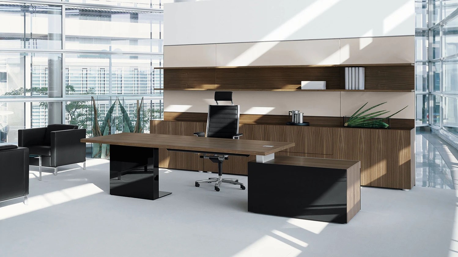
Modern working methods require modern office solutions – using intelligent office furniture. With a wide product range for all zones and areas of the office living space, Bene office furniture offers versatile and individual design possibilities. Bene combines the highest quality and functionality of office furniture with modern design and innovative technology.


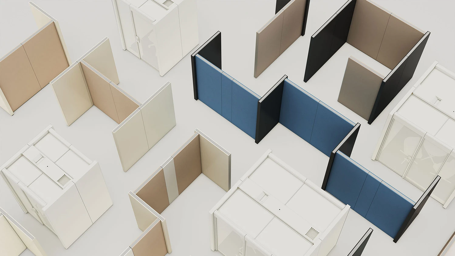
Areas of Application


Different companies have different needs and therefore different office landscapes. The combination of components and the individual design of the space are based on how work is done in a company. Therefore, it is crucial to define all the ingredients and their quantities and create the recipe for the office space.
References
Together with clients and partners Bene designs places for communication, cooperation, concentration and recreation. The office becomes a living space, divided into a variety of zones and areas, similar to an urban landscape — perfectly tuned in to the specific work processes and day-to-day requirements of employees.


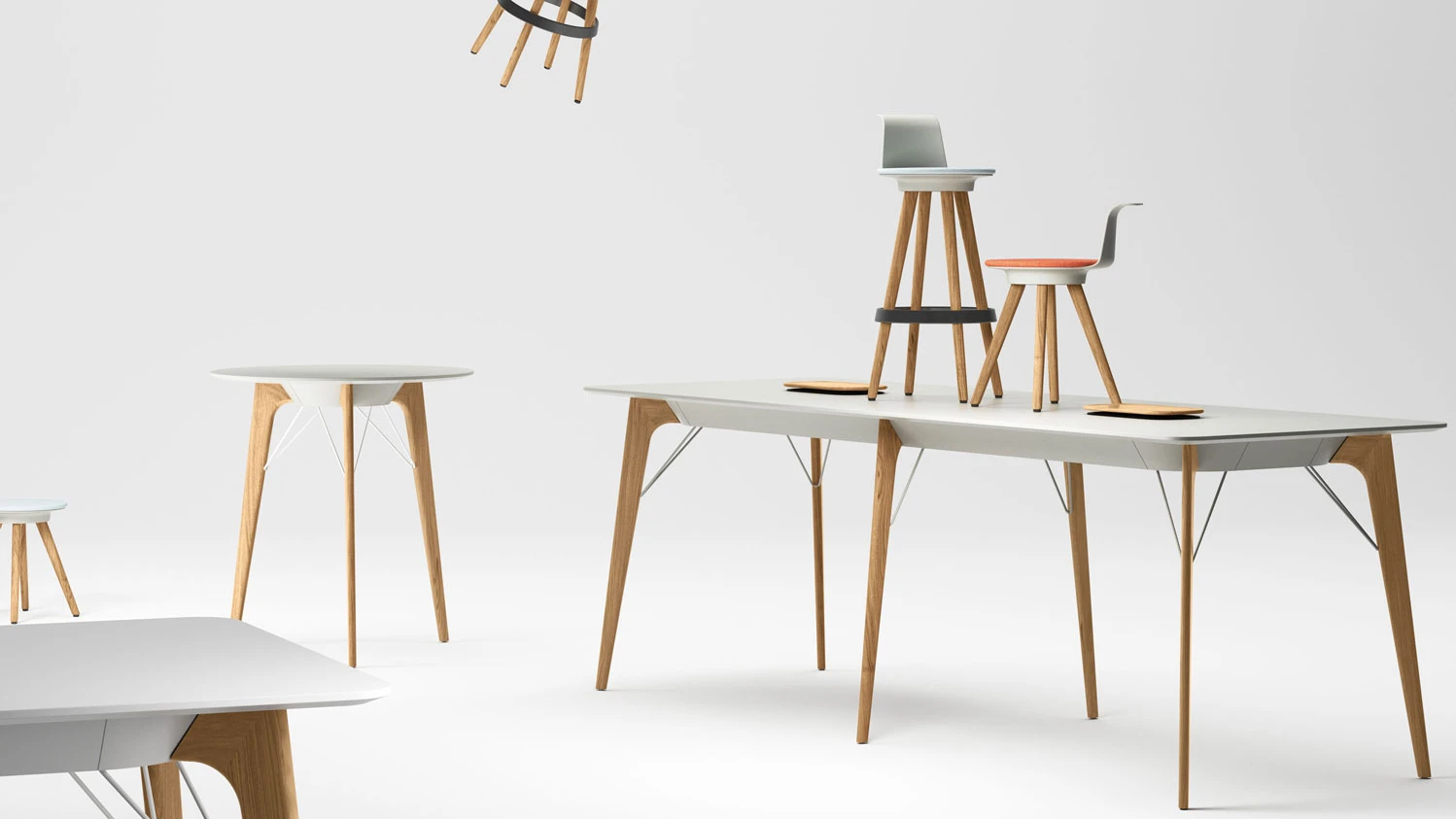
Design lines


ABOUT BENE:
OFFICE FURNITURE MANUFACTURER FROM AUSTRIA
Bene is an international office expert and specialist in modern office design and furnishings. Founded in 1790 as a small joinery in Waidhofen an der Ybbs in Austria, Bene has been producing inspiring office equipment worldwide since 1951. Bene has always been an office outfitter focussing on design, functionality and Austrian quality. Place your trust in our years of expertise and transform your working environment with Bene office furniture.